Saturday, March 31, 2018

Finally, A Book That Explains Contemporary Art!


     I have a habit of collecting books, historical often but am addicted also to art books. Famous artists, works of art, history of art ... you get the picture. I am not exactly sure how I stumbled on WHO'S AFRAID OF CONTEMPORARY ART by Kyung An and Jessica Cerasi, probably something I read in the Sunday paper, and ordered on Amazon or found in the Barnes & Noble in Palm Desert. 
     While I don't know where I found it, I read it and am glad I did.
     To be honest, much of contemporary art eludes me. I never really had a deep appreciation for the Expressionist period, though I did love the art of Vincent Van Gogh, until I went to the Los Angeles County Art Museum with a tour of their exhibition by the curator of the exhibit. Walking through the show with no visitors, she was able to explain much of the motivations of the artists in a way that was, well, in plain English. Explaining and standing among this amazing collection, I could finally understand the world as seen through the many artist's eyes.
     All art is a form of reflection, be it of beauty, history, rebellion, and probably much, much more. With an image of one kind or another it tries, much like a writer with words,  to tell a story.
MONA LISA by Da Vinci
   The irony of art today is that a realist image of the MONA LISA is the best known and recognized painting in the world, the entire world. While the enigmatic smile befuddles us even today, there is a form of peace and quiet that haunts. Few would consider this contemporary art today, but it was quite modern in its day. It is an image that haunts and often made fun of today. Maybe that is a token of appreciation to its amazing and haunting image. Often we mock what we do not understand.

STARRY NIGHY by Vincent Van Gogh


   The second most recognized painting in the world is Van Gogh's STARRY NIGHT that resides at Museum of Modern Art in New York City. 
     Now this is art that is starting to enter the realm of contemporary art. What makes it so amazing is how this early contemporary art piece has captured the hearts and minds of art critics and viewers. When he painted, Van Gogh's art caused consternation of fellow artists and much has been made of his mental state. Was he crazy as so many allege? Or did he lead the way for fellow artists to paint what they felt, not necessarily what they saw. 
     WHOSE AFRAID goes a long way towards explaining modern, contemporary art. To me art was painting, but increasingly we are seeing film, video, people acting out or machines doing things that are also called art. Warhol famously made everyday objects "art." Probably since the end of the Second World War, though there were movements in Europe from the time of Van Gogh, that art became increasingly abstracted. Duchamp's NUDE DESCENDING A STAIRCASE was all color and lines; there was no figure per se. German artists came on board quickly having missed the French Salon Era but were temporarily halted by Hitler who hated contemporary art and put a stop to it. Both sides of the Atlantic exploded after the war. While we may not be as familiar with it Latin and South America fell in line. Looking at a volume of Latin artists you realize they also painted all genre's.
An index of explaining contemporary art
    An, a curator at the Guggenheim in New York City and Cerasi, an Exhibitions Manager go a long way toward making the puzzling, puzzle solved. Going from A - Z, with some quirky uses of the letters, explain what artist are trying to show, to depict, how a gallery works, the amount of work it takes to mount a show, how artists are merchandised  both in a gallery and what have become increasingly, worldwide shows. 
    One chapter especially tickled me. They went head on and in their way chastised the verbiage of art. They ask, "Why is it so difficult to find plain English in the art world?" They go on to cite a study of this form of "Artspeak" using press releases from the Internet for 13 years. What were the defining features? International Art English (IAE) loves to invent nouns: 'potential' becomes 'potentiality," ' experience becomes experiencability. In IAE the longer the word the better. This reminds me of an English class I took in college. We had to take so many English credits and one of my teachers more or less liked my writing until he found out I was a Journalism major. In short Journalists are taught to use as few words as necessary. He felt that "more" description was better. He finally relented and gave me a "B." Maybe this same professor was hired by the art professionals.
    That said, and I am glad they said it,  I know the next time I see a gallery show and stare at some abstract of whatever it may be, or abstraction of something familiar, I will try to understand what the artist is trying to depict. Though I still feel that if it's that obscure, maybe it needs some refinement. If you can talk to the artist, that makes it all the better. Artists really are visualizes, societal mirrors if you will, and as anyone knows after reading a book then seeing the movie, the vision of the author is often not what the director sees and creates.
     
Thank you for reading my blog. I invite you to take the time to read earlier blogs where my emphasis is to explore the ways art and design affects our daily lives ... and always has. I share with you what inspires me with the hope that it will inspire you as well. Comments are always welcomed! 

Be sure to check my ETSY store ... KrugsStudio.etsy.com. I am adding many new and exciting, collectible birdhouses and craft items. Many of the items talked about here will be for sale there!

Tuesday, March 27, 2018

Are Tattoo's The New Collectible (Wearable) Art?

 
Age is not kindly to tattoo's
   When I was a kid I can remember that many of    my father's friends, most who had served in the military during World War II, had tattoo's though my father didn't. My prim and proper mother thought they were very low class and from this woman (who made me read Amy Vanderbilt's BOOK OF ETIQUETTE) I inherited my ideas about tattoo's. 
  Frankly few of my generation got tattoo's though I suppose those serving during the Viet Nam War changed that. I just thought they were low class and few, if any of my classmates in college, had them.
   When we moved to our home in the San Gabriel Valley in California there were still several homeowners that had served during WWII. Mr. Bullock, two houses down, was memorable as he usually worked in his front yard shirtless and my 4-year old son was fascinated by the huge eagle that spread across his chest and stomach. I'm sure, in its time it was magnificent but well into his 80's, the eagle had landed. You have to wonder how many of our children will discover this simple fact as they age? That droopy eagle's wings sagged a lot.
  Captain Cooks first visit to New Zealand exposed
  Europeans to the Maori who tattooed every part of
  their bodies ... not so unlike what we see today. 
  However, as the 80's faded into the 90's I began to see more and more men, first, then women who had a small tattoo here and there. I never worried about my son who fainted at the sight of a needle but was told my daughter had one that I couldn't see. One nephew in particular had bolder and evidentially colorful tattoo's on one arm, then two and finally other parts of his body. And they are not cheap either.
  I began thinking about tattoo's as art after seeing a new millennial resident walking around the complex today and it suddenly hit me, rather than buying art is this generation turning itself into art? Think about it. In an era with so much being the same is this the ultimate act to distinguish ourselves? Are tattoos ART or merely some kind of vanity? 
Popular Ancient Roman tattoos.
   We know that tattoo's have been used in just about every society in history. Ancient Egyptian mummies, Chinese, most of Polynesia, Greeks and Romans, Celts and on and on. Jews and Muslims forbid tattoo's but I believe even this generation has abandoned that stricture. A Star of David worn with a full sleeve arm (tattoo) proves that.
   Tattoo's have been used in a wide variety of situations ... to denote power, on slaves, as decoration, you name it. Cattle today wear a brand  to prove ownership. In our history brands were not just placed, sadly, on cattle.
   When you look at the cost of even the simplest tattoo (above) you begin to realize that this is not just a simple case of branding ourselves. It begins to enter the realm of buying art. These people are
When young performers wear them, why not the fans?
buying art but instead of hanging it on their walls walk around wearing it for all to see. While once it was something you hid except in intimate moments, men and woman began to wear fewer clothes to show to the world their new "art." While it may have had its start in the military in our era, it has had a long and honorable past that many cultures have cherished. In aways, Europe and now America has rediscovered a type of art that most collectors and curators might eschew but has graced us for millennia. The men and women of today like it and while it is a form of disposable art, it certainly is art.
Most military tattoo's are symbols
of patriotism ... love of country.


Japanese tattoo's had no problems with
western style inhibitions.
   
  For many military men and women today, other than say prison, what they could tattoo and show followed a strict military policy. Much like piercings, they were forbidden to show any form of tattoo above a collar or outside of a long sleeve shirt. Yet, with so many young and talented citizens getting and exposing more of their bodies to tattoos, and reluctant to pass up on the very best out there, standards have loosened. There are policies that regulate what can be written and seen. Exposure has been loosened but comments "prejudicial to good order and discipline" are prohibited. Racist comments may be your right to say, but not wear in the military, nor for that matter, anywhere. 
While the art may be beautiful that does not
necessarily mean the body will remain so.
Is that a paunch?
Celtic tattoo's
    It is in the larger areas of the body, a full half or entire body tattoo where these new tattoo "artists" really shine. Where once you would see low riders in Los Angeles cruise up and down the boulevard's with their lowered and flashily spray painted cars, it wasn't long before the art of tattoo's flourished on bodies and not just cars. It was further enhanced when more Asians immigrated bringing their centuries old traditions with them. The Chinese Tong's and Japanese Yakuza gang's all sported tattoo's under their white shirts and dark suits with just a hit of something creeping up their necks. It was at the local gym and its many new Asian clientele that I became aware of them and was awed by the detail and clarity of their body art. I think that was my first real realization that this was, however impermanent, art!
   It's hard to know what is and what is not art. But take a quick look on Google - images - tattoos. You will bring up a vast number of photos showing simple, silly and at times stunning body art.
   You have to ask, is that not beautiful? Is the person who created this not an artist? Just like some of the graffiti that graces walls, sidewalks and building around the world, mankind has an urge to create something. It might be beautiful or ugly, bring up things we would rather forget, signs of protest and scenes of great beauty. 
I'm sure the Disney Company never authorized this!
  The Warhol show I recently saw, once again, made me realize that art is all around us. Often we don't notice it yet who can deny not knowing the apple bite of Apple? The four rectangles of Microsoft Windows? The blue round oval of the Ford Motor Company? A Campbell's soup can? Like tattoo's these are brands, a kind of branding not unlike those used in ancient Greek or Roman symbols. Symbols confer power, and to mankind they have always held great magic and power.    However, some tattoo's may include symbols their owners may not have envisioned. Somehow I can't imagine the CEO at Disney sporting a Snow White scene on his back.
   Is there a limit? I don't know. It seems that many that start can't stop. One sleeve (arm) becomes two, one chest symbol then covers the whole torso. So, are these considered patrons of the arts ... only art not purchased at a gallery but the local tattoo parlor, also from the original artist? I am sure there are tattoo artists who are famous and can demand ever increasing prices. Is this not any different from what a photographer or artist putting paint on a canvas does? I think that while many might never want any and dislike evidence of this on a body, it is here to stay and has been part of every culture from the beginning of time. Like all fads, it too will run it course, for awhile, and be reborn again.
    The family that tattoos together, stays together? They can
    at least share the pain. And there will never be a problem 
    identifying the body!!!

   
Thank you for reading my blog. I invite you to take the time to read earlier blogs where my emphasis is to explore the ways art and design affects our daily lives ... and always has. I share with you what inspires me with the hope that it will inspire you as well. Comments are always welcomed! 

Be sure to check my ETSY store ... KrugsStudio.etsy.com. I am adding many new and exciting, collectible birdhouses and craft items. Many of the items talked about here will be for sale there!

Monday, March 19, 2018

Defining Colors and Design

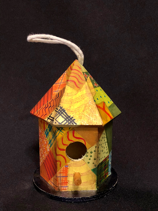
Here they are, one large and three smaller mini-birdhouses. They
all use the same colors and "fabric" designs but you would never
know it!


While I have been creating, if you will, a series of eclectic birdhouse designs, my first claim to fame was a contest I won back in 2012. I was taking painting classes from a teacher who was also a DecoArt instructor and she encouraged me to enter one of the new style birdhouses I had come up with.
   I had started craft painting in my 50's as a way to relax from my graphic design business by following my roots - you see my Dad was German. When I started to paint birdhouses as a way to relax I was drawn to Pennsylvania Dutch folk art. You see "Dutch" was a corruption of "Deutsch" the name for Germany. Leave it to the English, right? Anyway I got some books, studied German folk art and began creating my own designs.
As any craft painter knows, neatness is on the bottom
of your need to do list. It took over 30 paint colors to
create 4 birdhouses.
   Never one for staying in the same mold, I began to play around with other designs, got books from the library, took classes in Vegas picking up more books on the subject and taking classes as well.
   Since my wife at the time was a quilter, I would look at her quilt patterns and decided that they could also be considered folk art designs. My first attempt at this, a style I called "Crazy Quilt" was very geometric but I decided that like a quilt, each time I used a background color, I would put the same "painted" pattern on it. I started then with a geometric Crazy Quilt!
   My teacher heard about a contest DecoArt was sponsoring around the country for craft designs using their materials. I was reluctant but she encouraged me to enter this first attempt. First I found out my birdhouse was reduced to three national finalists and while on a cruise to Alaska found out, docked in Juneau, Alaska, that I had won. There was no cash but several boxes of paints, stencils, brushes and the like. I was both surprised and elated. I was on my way. 
Here you can see the base colors
and the starting of the color pattern
   Over the following years I tried a more random kind of crazy quilt following the rules that every base color would have the same pattern painted on top. I painted birdhouses, boxes, trays, sewing boxes, dishes and many have sold on my Etsy store. I also found out that the brighter or lively they were, the more they would most likely sell. In fact, I had been using a tissue box I had painted a few years back and looking at it several weeks ago thought, well, why not put it in the store? I did and it sold a day later.
Here is the same birdhouse finished.
   As I struggle to get productive again, I came back to my love of the crazy quilt idea and remembered the box that sold had been painted in a kind of rainbow, meaning that each side of the tissue box had a difference main color starting: red, fading to orange, fading to yellow, fading to green with blue and purple on the top. It made for an interesting box because no matter what side you saw at any time, the colors seemed to belong. I always made sure a color from another side flowed into a new color way.
Same exact colors as red base but
started in a different sequence  with
a dark base.
Even changing the base color made
a vast difference
   Realizing that I had three small six sided, or mini birdhouses and found, in my huge stash, a larger 6-sided footed birdhouse I decided to follow the idea of the tissue box. Here with six sides it was much easier.      On the large birdhouse I reversed the 6 colors top and bottom then used the exact same colors on three, hanging, mini-birdhouses that followed the same sequence of red to purple on top and bottom. While it was complicated at least I could paint on all four in sequence and when I got to the end and started the next base color or pattern, the first one was now dry!
This top view gives you a view of most of the
color ways and the patterns each base color had.
   Generally I had about 5 colors per base color way and had to be sure that at least one would invade the next color way so that it looked continuous no matter how you looked at it. And I can certainly say that each color way was repeated on every single one of the 4 birdhouses ... yet, I was amazed at how different they looked. I did not follow the same pattern of the quilt fabrics only followed the base colors and patterns of each one.
   The final, and believe me, the most tedious step was "stitching" the fabrics together. I tried a gold gel pen but on wood and acrylic paint even water washed most of the "sewing" off. This time I got a very fine liner brush and painted it on using gold paint. I hate this part the most and for awhile used a gold fingernail paint pen that gave me consistent gold lines but I have been unable to find the product I originally used. Not happy with the fading or washed out ink finally painted the stitches on today. Well, if there is anything good about this, you won't have to worry about the fabric fading or the thread unraveling!!!
Its all in the details!
   It does keep you busy and as a friend noted today, I should stick with the larger birdhouses as it takes about as much time on the small ones as the large ones. He was right. They do. In fact those small buggers probably take more time and people can't seem to understand why you ask so much for something so small. I can tell you. THEY TAKE JUST AS MUCH TIME ... maybe more!
   The final paint step is what I call antiquing. I use a dark brown wash on all the edges or corners. That tends to tone down brighter colors and actually makes even discordant colors harmonize. This time I "antiqued" all but one. Which one will be most popular? I don't know. Guess I will have to let the marketplace decide on Etsy. One thing is for sure, while they may have all used the same colors you would never tell!

Thank you for reading my blog. I invite you to take the time to read earlier blogs where the emphasis is to explore the ways art and design affects our daily lives ... and always has. I share with you what inspires me with the hope that it will inspire you as well. Comments are always welcomed! 

Be sure to check my ETSY store ... KrugsStudio.etsy.com. I am adding many new and exciting, collectible products. Many of the items talked about here will be for sale there!

Saturday, March 10, 2018

Remember When? And Wonder Now?

 
For some reason this Rockwell cover stuck
in my mind. It shows how quickly Americans
became, well, Americans no matter where they
came from. Having a German father helped.


When I was a kid growing up, TV was brand new so we depended on the daily newspaper, the weekly magazine and the newsreels that started every Saturday matinee movie. Being visual, I can remember pouring over THE SATURDAY EVENING POST, LIFE Magazine and at my grandparents some pretty lurid cops and robbers magazines my Grandfather had.
   Billboards were actually the major advertising venues after magazines. I can remember ads such as the one with Jack Webb extolling the virtues of his Chesterfield cigarettes. You have to remember the first real warnings about cigarettes and the relationship to cancer didn't appear until 1959. I can remember in my high school freshman biology class we were all required to watch a movie about the dangers of cigarettes. It was pretty graphic. The poor soul on the operating table had to have one very black lung removed and on the way out they tickled his heart. All the school's football players passed out while geeks, like me, sat grim faced. BTW, the football coach was our biology teacher.
 
Everyone watched DRAGNET back in the day so this endorsement
hadclout. Webb died of heart failure at 61. Many feel cigarettes
were the cause.
 Many ads simply were not allowed ... no lawyers, no advertising doctors and definitely no patent medicines. They were forbidden and soon the first warnings about cigarette smoking came out with finally a total ban. Beer could be advertised but you could never be seen actually drinking it!!!
  Using the guise of "free speech" lawyers finally were granted the right to advertise, at first just their name and number but soon that was jacked up to some memorable ambulance chasing ads. Generally they have replaced the soaps as denizens of daytime TV.
This ad speaks for itself!
   That brings to mind the soaps. When I was growing up "soaps" ruled the airways. Most women were stay at home Mom's despite what MAD MEN would have you believe. Every station had soap operas, called that because soap manufacturer's were the principle advertisers. Most soaps are gone now but to hear our mother's talk, what so and so did on such and such show had the ring of reality! In many ways, those were the good old days.
 When cable arrived with even more opportunities for advertising, more and more late nights shows and shopping networks were invented. Late night became the playgound of "infomercials" where all kinds of things were huckstered. These are the guys that sold things not deemed suitable for the average store like Sears, Kmart or even Walmart ... then
   Tonight watching the CBS evening news I was startled to see all in a row ads for the "Hover Cover", "Flawless", and "The Wonder Bible." I had seen them before but not in that order. Those, even five years ago, would have been relegated to the late show format with their ... "Wait there's more" cry. When did AS SEEN ON TV ads make it to prime time? Even more, when could these companies afford the usurious rates that Ford, Bud or Viagra can afford?
Hover Cover ... buy it at
Walmart. Its cheaper.
Watching women pluck their mustaches is not dinner fare.
Will the husband and wife that shave together stay together?
   Actually I shudder to imagine what the next wave of ads will bring. What we are subjected to now is pretty bad. These informercials that go on forever are bad enough.

 But the most recent wave is the one that, from experience, drives our doctors crazy. I'm taking about ads for medicines. Now, from my own experience it does pay to ask questions but, as I wrote in an earlier blog, even if you're not sick by the time they list all the side-effects you might get from taking them, you will be.
If this didn't make men squirm
 I don't know what else would.
           Remember when Viagra hit the airwaves? That provided fodder for late night TV for months if not years. Since men are far more reticent to discuss personal health issues you had to wonder who those ads were really aimed at? One little Viagra pill could set you back up to $60.00 as pharmacy insurance didn't cover it!
   With the release of Viagra on TV, the gold rush began. Just about every disorder you could think of was talked about. Bladder leakage, heart attacks, memory loss, eye vitamins, insulin, pneumonia, even adult diapers sweetly called Depends ... the list goes on and on.
   I don't know about you but I would rather see suds, drive the USA in my Chevrolet, plop plop, fizz fizz oh what a relief it is, Bucky Beaver shilling Ipana toothpaste ... you get the picture. Tonight, I felt that I was at the carnival on the midway and all that was missing was the bearded lady!
   In 1976 the movie NETWORK was released. In it a TV news anchor-man, played by Peter Finch, went crazy by what television had become. His memorable line was, "I'm mad as hell and I won't take it anymore." He won the Oscar post mortem, he passed before the movie released, as the anchor-man who lost it. In many ways, Paddy Chayefsky's script predicted the FOX Network. All they need to add now is the fortune teller. Maybe that's next. Infomercials have hit big time!
   TV certainly is a time capsule of our life and times. Watching those ads tonight, I wonder what is left? 

Thank you for reading my blog. I invite you to take the time to read earlier blogs where the emphasis is to explore the ways art and design affects our daily lives ... and always has. I share with you what inspires me with the hope that it will inspire you as well. Comments are always welcomed! Be sure to check my re-opened ETSY store ... KrugsStudio.etsy.com. I am adding many new and exciting, collectible products. Many of the items talked about here will be for sale there!


Andy Warhol 50 Years Later

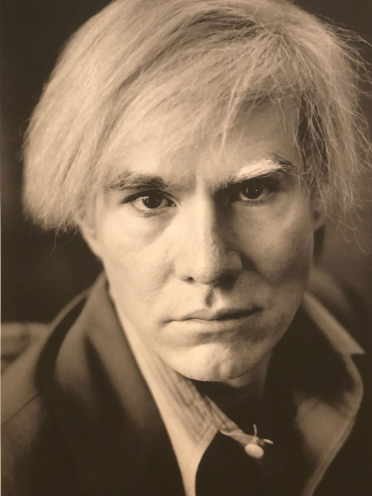
Andy Warhol


For those who have never visited Palm Springs, all they might think about is that this is a small deserted desert town. In fact, I can vividly remember my first visit in 1959. My aunt and uncle lived in Highland Park, a part of Los Angeles, and on our first visit to Los Angeles, we drove out to Palm Springs for a days visit. It was an amazingly hot day, a kind of day we rarely if ever saw in Portland, OR. We had an old 1951 Nash Ambassador with, in those days, NO air conditioning. 
   What surprised me was that the city looked deserted. There were no cars on the streets, no people walking anywhere, even the stores looked empty. We finally saw one of the local denizens so tan and wrinkled, barely clothed in a tiny bikini; she looked like a walnut. Little did I know back then that in 57 years I would return to live.
   While Palm Springs today has about 45,000 people and the whole Coachella Valley has probably about 500,000 with small towns strung out along the I-10 freeway, many parts still look pretty barren. Many would prefer it stayed that way. Trust me, the population nearly doubles in the winter with the flight of the snowbirds from up north. There are as many out-of-state license plates as locals on crowded streets. This year, especially, restaurants are filled with locals AND tourists.
Palm Springs Art Museum decked out for the Warhol Exhibit
   What I discovered was that for its size, it is one of the most vibrant places on earth. There is always something (often many somethings) to do every weekend and you seriously can't do them all. We've had a noted film festival, a car auction, home show, last weekend a famous world class art show in La Quinta, the air museum has events every weekend, Modernism Week just finished where for 11 days art and design of the 1950's is celebrated with people coming from all over the world to speak and see the treasures from the past, and this is just early March!
 There is also a great deal of wealth here and has been for many decades. Before WW II Palm Springs was the getaway for many of Hollywood's greats. Even after the war it was an important getaway and many major streets are named for the famous both in Hollywood, song or politics.
   One of the great finds, for me as an artist, is the Palm Springs Art Museum. They have an amazing collection but more importantly put on some of the finest exhibitions you can see anywhere. Even more amazing is that every Thursday, from 4 pm - 8 pm the museum is free. Really!
An original page from one of his illustrated books
   In January there was an exhibition of images by photographer Michael Childers of drag queens and such with many taken of Andy Warhol called "Having A Ball." Childers captured Warhol throughout much of his artistic life until is untimely end at the age of 58.
   On March 3rd an exhibition of Warhol's prints, drawings and images owned by the Jordan D. Schnitzer Family Foundation of Portland, OR, opened. It was the perfect companion piece to the earlier photography exhibit. They are running concurrently and are seamless.
   For me, this exhibit brought back many memories. His antics were reported in the newspapers and TV news of the day, a time when everyone watched one of only three national TV channels. I can remember we giggled at his silkscreens of Marilyn Monroe and Chairman Mao. How on earth could an image of a Campbell's soup can or a Brillo Box, something that just about every home had at the time, be considered art? Portland was where I grew up so I vaguely remember seeing some of his work at the Portland Art Museum. I was surprised to discover this exhibit was from a collection in Portland.
You can laugh today but these are worth a fortune!
   In college though, as a Journalism / Advertising major, he was taken more seriously. We learned that those packages were carefully designed down to the colors to attract the shoppers eye. Color meant everything and even donated the product type. Warhol had recognized this and worked to make us aware of this fact. His background, in fact, was from the illustrative side of commercial art!
   Most of his career is shown from his early shoe designs, the story books he wrote moving on to the amazing silkscreens he made. In fact one of the first things you see entering the museum is a large collection of silkscreens showing the steps necessary to make one of his finished silkscreens. It was, we realized, how he was able to make such a variety of Marilyn's or Chairman Mao's. The screens are always the same, it was the colors used that changed them.
Warhol's screen steps to make a print
Add caption
  For me, this exhibit brought back many memories. The sheet of S&H Green stamps was a blast to the past. Every mother collected them and a merchant who didn't give them out for purchases, did so at their peril. Housewives would just shop somewhere else. To see the many images of Mick Jaeger and realize Warhol had designed the infamous "Sticky Fingers" record cover with Jaeger in tight jeans, a bulging crotch and a working zipper (something we had to pull from the shelves of Kmart's), made me realize, maybe for the first time, how influential he was.
Chairman Mao
   His talents were many - commercial illustration, advertising, silk screens worth millions today, photography, sculpture and dabbling in some risqué Gay films, made him famous in ways not known today.
   The museum broke the galleries into the periods of his creative life and I realized for the first time that his famous Marilyn and Mao silkscreens were done when I was still in high school. By the time I started college in 1963 his work was well  known and shown everywhere. Little did anyone at the time think that this was art. The critics of the era frothed at the mouth dismissing his works as trash. However, it did resonate with the public and, as we clearly saw, with the Schnitzer family of Portland, OR. This collection must be valued now in the millions.
Mick Jager portraits
    If anything, looking at it now, I realized what I had forgotten
from my college days. Design can be everything. To see his silkscreens of the famous Chanel #5 bottle, Apple's rainbow colored Apple for the new MacIntosh computer, the famous portraits of Mao, and Marilyn, Marx Brothers, even George Gershwin, you realized what design was all about. 
   It's more about seeing, about presenting something that moves the audience ... be it to buy or admire, to consider and often to recognize. 
Alan with the Marilyn Diptych. She died
around the time these were made


   He died at 58 due to complications of gall bladder surgery. Yet in that time his work was prodigious. There are few artists today that have left such a legacy and have profoundly altered the way we consider art. It was interesting to hear the murmurs of the crowd, in most cases my age or thereabouts, also recount their memories of him and the products he featured. Young or old though, I felt many recognized what he was trying to show us, how images connect our lives and times.
 
Thank you for reading my blog. I invite you to take the time to read earlier blogs where the emphasis is to explore the ways art and design affects our daily lives ... and always has. I share with you what inspires me with the hope that it will inspire you as well. Comments are always welcomed! Be sure to check my re-opened ETSY store ... KrugsStudio.etsy.com. I am adding many new and exciting, collectible products. Many of the items talked about here will be for sale there!

Monday, February 26, 2018

THE TRUMAN SHOW: Revisiting An Amazing Movie 20 Years Later

   One of the fun things about living in Palm Springs, aside from the number of things to do just about every weekend, is hitting the consignment and donation stores. They are everywhere and with judicial shopping you can find some real deals. When I first moved here with little money, I searched for a chest of drawers. I didn't want some old cheap thing I would need to replace in a year so I watched a tall 5-drawer blonde piece that went from $350 to $225.00 over a few months. Its like eBay but in real time!!!
    The donation stores get some great things. The two biggest, with multiple locations, is Revivals, whose profits go to the Desert AIDS Project, possibly the premier AIDS and HIV center in the country, and Angelview, whose monies help pay for the healthcare of children in the valley. 
   During a 50% off of all donated items at Revivals recently I picked up a Blu-Ray copy of Peter Weir's THE TRUMAN SHOW. I had seen the film when it first came out in 1998 having decided I liked actor Jim Carey after seeing him in LIAR LIAR. He played a lawyer whose neglected son wished, as his birthday wish, that his father wouldn't lie anymore. He never showed up to any of his son's events despite his many promises. To see Carey, whose over the top acting annoyed me, in pantomime, and doing it well, made me realize he really was a good actor. 
   I liked Peter Weir, the director, and had been impressed with his earlier hits like WITNESS, DEAD POETS SOCIETY, YEAR OF LIVING DANGEROUSLY and the puzzling THE LAST WAVE. I saw it when it came out in 1998, 20 years ago I realized.
Truman ponders the meaning of life.
   While the movie did well at the Golden Globes and Weir, the scriptwriter and Carey garnered Oscar nominations. the film didn't win any Oscars. Carey, whose movies made lots of money, was not considered "serious" enough to the academy; the film was moderately successful.
   It sat on my DVD player for several weeks and finally, the other night I finally sat down to watch it. While I knew the plot I was not prepared for its message ... you see I watched it after watching the news and the wallowing saga of the Russian probe, the aftermath of the Parkview shootings and the battle to get some kind of order to gun control. In the aftermath of watching it again, 20 years later, I realized that like NETWORK, we were given a message and have chosen to ignore it.
   If you haven't seen it, it in many ways was a harbinger of the total reality show. Truman Burbank had lived his entire life on TV. He was born live and his entire life had been watched by a billion people all around the world. His community was a script and he was the "only" person who didn't know it. 
   He began to notice things, slips in the production. 5,000 cameras followed his every move that was broadcast live 24/7. Creepy feeling then and now, the entire town, the "perfect" community where nothing really happened was another version of a communal society, none I might add that never really worked. Yes, I can hear some say, "What about the Amish?" and today, even they are torn between the old ways and new as Weir showed in WITNESS 33 years ago. He longed to travel, visit Fiji the place he was told the woman of his dreams had gone too ... to see the world.
   As the film unfolds and Truman goes through his day it is, well, nauseatingly boring. Its just about like watching GROUNDHOG DAY where Bill Murray is condemned to repeat the same day until he gets it right. He dies a thousand deaths only to wake up again to "I got you Babe."
Advertising takes a whole new meaning in 
THE TRUMAN SHOW. Here his wife is shilling 
product placement. Sounds like today on any show.
   There is trouble in paradise though. Oddly, Truman buys women's fashion magazines and in a flashback we see a young woman he admired before the woman he marries is put in front of him. He secretly tears parts of cosmetic faces to recreate her picture. 
   After a harrowing series of scenes, one where his father is thought to have drowned when he ignored storm warnings and believed he killed his father, the nauseating placement ads where his wife sounds like a midnight informational advertising shill, the father suddenly appears from the dead, he gets up the courage to flee.  He manages like we all must, to conquer his fears to find out what really is out there ... and in this case, against all odds.
   His "creator," Cristo, played menacingly well by Ed Harris, tries everything in his power to drive him back even risking his death by drowning as the viewers watch wave after wave pound the little sailboat. Truman keeps on and does, in fact, nearly drown. A frantic sound crew finally appeals to Cristo.
World's end!
   Blue skies and calm winds return and Truman sails off into the sunset ... until ... his ship hits something. The boats bowsprit punctures a wall and in getting out to investigate, Truman realizes, what he had come to suspect, his life was manipulated. 
Cristo, the puppet master
   Cristo, sounding like God from the heavens talks to him pleading with him to return to where he, Cristo, producer of the Truman show, has created the perfect world. "Listen to me, I know you better than you know yourself!

"Good morning, and in case I don't see ya, good afternoon, good evening, and good night"
   In a speech that could have come from Caesar, popes, Lenin, Stalin, Mao and some might add Trump, that the real world was a dangerous place, bad things happen, don't go through that door, the door out of this elaborate soundstage, stay where you will be safe. Instead Truman bows, says his signature line, "Good morning, and in case I don't see ya, good afternoon, good evening, and good night," and walks out the door.
    In light of our daily world today, where cameras watch everything we do, as in China every 20 yards or so, airport security, the Russian probes where whether Facebook admits it or not we very easily could have been influenced in the 2016 elections and possible before that and now after, Weir caught the sense of who are we, who is influencing us and,  more importantly, what are we going to do about it. You will never look at an ad, or see the placement of a product, car, computer, watch again and not see Laura Linney's smiling face shilling whatever product the producer wants. UGH!
   In Cristo's case, we should remember that power corrupts, absolute power, such as he had, corrupts absolutely. We must all, like Truman, be brave enough to walk away, as he did, at any price.
   If you have never seen it, I urge you to watch THE TRUMAN SHOW. If you have but once, like me, ages ago, watch it again. 20 years later it is just as relevant today as it ever was then.  As Santana so eloquently said, "Those that forget history are condemned to relive it.  Unfortunately, as we are all seeing nightly on the news, life does recreate art!

Thank you for reading my blog. I invite you to take the time to read earlier blogs where the emphasis is to explore the ways art and design affects our daily lives ... and always has. I share with you what inspires me with the hope that it will inspire you as well. Comments are always welcomed! Be sure to check my re-opened ETSY store ... KrugsStudio.etsy.com. I will be adding many new and exciting products. Many of the items talked about here will be for sale there!
   

Saturday, February 24, 2018

Creating a TOPSY-TURVY BIRDHOUSE

 
Being upside-down certainly gives you a
new perspective, that's for sure!
 Since I first started painting birdhouses, drawn first to Pennsylvania Dutch styling where the "Dutch" is an English corruption of Deutsch or German, and I am half Saxon, one of the Germanic tribes, I moved on to other styles being especially drawn to Norwegian Rosemaling with its flourishes and color, a style that reached its heyday in the 1700's and is seen only in a variety of museums in Norway today.
   Then, I started to experiment by combining styles, then trying out hand painted scenes such as the view from a bi-plane down or the view from the ground up, taking two-dimensional art and putting it on a 5 or 6 sided birdhouse. Yes, I tried abstract type creations. When a friend suggested that I try one upside down, I was intrigued and had never thought of that before!
   After creating a larger abstract birdhouse for a custom order, I found myself drawn back into the studio I had worked so hard to create! Moving and creating space twice in one year, then all the other events since I moved to Palm Springs a little over two years ago, I was tired and felt uncreative. However, after several sales and having to recreate again what I could not find, I was drawn back to my studio and having fun again.
   I must admit though, this project was quite a challenge and took some time for me to decide what I needed to do to make it work!
Topsy-Turvy started its life like this!
   The first step was finding the right birdhouse. With so many raw birdhouses in my stash I was tempted to start small. However, the round ones or 6 sided ones I wanted to use already had string to hang them by so, I rooted around until I found what I thought would be the perfect one, perfect that is, upside down. I felt that if was to be upside down, it should really be upside down. 
   The roof, now a bottom, would be a garden with leaves and flowers and I would sprinkle images of the seasons on its six sides. I still needed to consider a design of elements to tie it all together though and pulling out drawers and looking at my collection of add-on items finally found what I wanted.
I had to create it upside
down to make any sense
of what I was trying to do.
  First came the design noting where the elements would go with the first coats of paint.
Adding the bottom trellis finally made
the upside down effect fall into place.
 The heart, my signature element of course, was added to the bird hole entrance, and everything else flowed from there.
   I started with the red heart and then the diamond shapes that were added to the bottom, now the top, of the ridge below the feet now the top. 
   Next came the
elements for the sides. A mirror on one, a wooden Christmas tag on another, wooden star on one side, another added later to the top, a laser cut clock over a created fireplace mantle ... "&" for a spring like effect that completed the sides. The pieces were painted and allowed to dry, then work began on the bottom.
 A burnt umber trellis was created first, then leaves were added outlined with a gold pen. Dots of pink randomly placed with even lighter dots became flowers that filled the new bottom that might have been the roof. In fact, it was the roof that took the most time because of the layers of design and paint. Yet, once it was done I considered that you rarely see much of the top of a birdhouse and in the past few years I have been taking designs to the roof, not ignoring them as I had in the past. I was easy to include the roof and in fact made it appear to be more of a complete design.
The various elements glued into place.
   Once the "bottom" was done, it was time to start finishing the painted elements and adding the items that would be glued into place. That was the fun part. If I had any reservations, I realized, that time was long past. After so much work to create this it was too late to make any major changes. Well, I could but after hours of creating this there is a limit of your patience.
A silver star as a base for the golden
ball, then adding a red jewel was the 
perfect, finishing touch!
The last decisions were for the old flat bottom that became the top. Since it would have been the bottom with a wide flat open space, what should I do there? I tried to postpone that decision and did until the bottom and sides were all done, the parts glued in place and then ... what? I even had the hanging hooks screwed into place. 
   Back to the drawers and checking out all the wooden pieces collected over the years. First I grabbed a big wooden ball. Painting it gold I realized that even on the stylized roof it needed something else, something more. Grabbing a wooden many pointed star, I put it on the flat painted, tiled roof, then the newly painted golden ball and thought, this is the perfect "ending" if you will. As a contrast to the gold, I painted the star silver, glued it in place, then the golden ball and to close the opening in the wooden ball, I guess meant to be part of a necklace ( I can't imagine but .... ) found a red jewel and glued it on, a perfect finishing touch!
One-of-a-kind birdhouse complete
   For my birdhouse, at least, I have found that a coating of "antiquing," usually a darkish brown rubbed over the edges and various elements, then blended with clear water tones down the colors and blends all colors into a harmonious whole. It did here as well. I tend to choose bright, LOUD colors and the antiquing tones everything down. If this piece intrigues you, you will find it on my Etsy.com store for sale. Look up TOPSY-TURNY BIRDHOUSE.
   If nothing else, this experiment has taught me that it never hurts to experiment. I think we all get into ruts, creating the same thing over and over. I was ready for a challenge and am now working on a larger, even more abstract birdhouse. Let me know what you think!

Thank you for reading my blog. I invite you to take the time to read earlier blogs where the emphasis is to explore the ways art and design affects our daily lives ... and always has. I share with you what inspires me with the hope that it will inspire you as well. Comments are always welcomed! Be sure to check my re-opened ETSY store ... KrugsStudio.etsy.com. I will be adding many new and exciting products. Many of the items talked about here will be for sale there!