 |
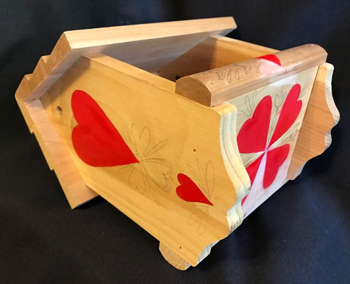
| It didn't look this in the store, trust me! |
As many artists know, the idea of a gift for a special occasion can be a traumatic time. What to give? What to CREATE? Will it be appreciated? As confident as we might be outwardly, I think inwardly there can be tension and even doubt. I do know that non-creative types really have no idea of the time it takes to make something. Our lives are divided up into segments, we do this, you do that. It is a rare individual today that creates something from scratch to finish.
This year, for me, I've two times that I had to consider what to create, one with a clear request, the other what I wanted to create and give as a gift.
 |
| The original ugly duckling |
The first request was for an "awesome" birdhouse but as I started working with it, it became a decor piece not something that would hang outside. Why ... I can't really say. Why it turned out the way it did, it seemed to take on a life of its own.
I've had this experience before, when I started my oil painting classes. Despite my best, and the teachers intentions, my art style became something very different and I seemed to have no control over it. This led to arguments, hurt feelings and finally, after much thought, I left the class.
I bought this birdhouse several years ago and after getting it realized it wasn't my usual type of birdhouse. In fact I had always avoided bird feeders, there just wasn't anything to paint. As I was to find out, I was very, very wrong. I was used to painting all the sides, the roof and even the bottom. This had very large open sides and I put it away. In short, I didn't know what to do with it.
 |
Sketches are perfect for getting the arrangement of
the elements you want to use. Its much easier to make
corrections here than on the actual item. I know.
Been there, done that!
|
When I moved into my condo last winter, I again opened the boxes of things I had collected but had not gotten around to painting yet and decided to put it on the studio shelf putting the rest of the items in the box in the storeroom. There were several outdoor hooks that I could hang things on, so it stayed.
With the imminent arrival of the person I wanted to give a birthday gift too, and urging from a close friend to get busy, I sat down and made a sketch (left).
I really urge you to sketch out your projects first. The amount of time they save, and disasters reduced, helps to give you time to reflect and thoughtfully plan your design. As you can see here, the final sketch was pretty much faithfully followed reducing the time I would have needed to figure out all the elements while painting it.
 |
Red, red, red! Yes on the bottom too!
Remember it hangs so you can see it!!!
|
This is NOT to say it all went smoothly nor that mistakes weren't made. They were. The biggest was that in my eagerness to create I would paint this side and that and realize that where I had started might get smeared so ... that led me to have several other projects I could work on while this one dried. Desert or acrylic, paint still needs time to dry!
 |
| The two basic colors were applied. |
After a quick sanding of rough spots, the first coat of red was put on and then allowed to dry.
Next came the butter color that defined the edges of both sides. Once that was done I used a raw sienna color to create what I thought would represent the roof cross-hatched trellis. I had to use several coats and then outlined it with a black micro pointed Sharpie. I didn't have to wait too long for this to dry as we were experiencing 122º days and about 6% humidity. The biggest problem was getting it on before the paint dried!
 |
After the trellis dried I used a clipped stick sponge to
dab two tones of green paint randomly over the trellis.
The using the trusty Sharpie I added leaves including
veins on some. The white dots represent flowers.
|
Next came the roof ... something that for many years was the bain of my existence until I realized that it too should be included in the design. Once I realized that I learned to decide just what I wanted to add to enhance the design of the sides, and sometimes the bottoms. Roofs are easy to ignore. A drive down just about any street worldwide shows a lack of imagination. Shingles, shakes, tiles ply across vast expanses and no one thinks about them ... unless you're a crafter!
One of the greatest challenges is to know when to stop. Coco Chanel pontificated that "less is more" but we seem to live in a time of excess where the belief is "more is more." It is around us everywhere, to me, most notably in the newest Prius. It looks like it was designed by the same crew that designed the 1958 Edsel. As some wag said at the time, it looks like a camel ... a creature designed by a committee. The Prius may be many things, but beautiful, it is not! They just didn't know when to stop!
 |
| Leaves on the sides and ends use the same greens as those used on the roof. |
I usually try to use the same colors over and over again to give each piece a kind of cohesion. They may not be used the same way, but the colors stay the same. After the roof, the leaves were added to the flowers and hearts on the ends and sidebar.
 |
| How to hang? |
The band of cream on the sides and painted on the ends had added hearts that I outlined with a red Sharpie micro point pen. They mirror the large hearts used on the ends keeping the color palette simple but not boring.
The next and last challenge was how to hang it. It had holes at each end evidently to remind you it was meant to hang and be used as a bird feeder. Friends suggested several possibilities ... knotting a rope on each end or a contractor friend suggested using a dowel all the way through it and then using a rope on each end. So ... off to the hardware / craft store.
 |
| The finished bird feeder ready for seed and especially ready to hang! |
I felt that if I used a dowel instead of a knot at each end, I would need some kind of a dowel cap. At Michaels I found a dowel that just fit through the side holes and small wooden pots that were on sale. So got them both, brought them home and painted the dowel with the antiquing paint I was using and the pots for each end red!
Rather than just using jute (which was what I would have done), the clerk at Michael's suggested that I use a florists wire ... jute with wire inside. Turned out to be the best of both worlds. It looks like jute but with the wire it is much stronger and will still be there when the jute is long gone.
The final step was to use an oil based Varathane for outdoor use. This too was a recommendation after a rather catastrophic failure of my acrylic varnish a few years ago. Even though it had three coats before going outdoors, as the salesman at Home Depot explained, acrylic gives a firm solid finish that doesn't like to get hot and cold. After awhile it will crack and let moisture inside ... exactly what happened. Oil based outdoor finishes will expand and contract far longer as they remain somewhat more fluid. My experience with my bird feeder here seems to confirm this. Plus oil can always go over acrylic, NOT the other way around.
So, this was my creative journey. Was it a success? Well, I will find out in a few days. I do know the "awesome" birdhouse was a success.
Thank you for reading my blog. I invite you to take the time to read earlier blogs where the emphasis is to explore the ways art and design affects our daily lives ... and always has. I share with you what inspires me with the hope that it will inspire you as well. Comments are always welcomed! Be sure to check my re-opened ETSY store ... KrugsStudio.etsy.com. Many of the items talked about here are for sale there!
Super cute!
ReplyDelete