When I designed this "patchwork plate" I realized just how strong that trend was. Bold colors, strong design ruled the day. There is nothing quite like it today either.
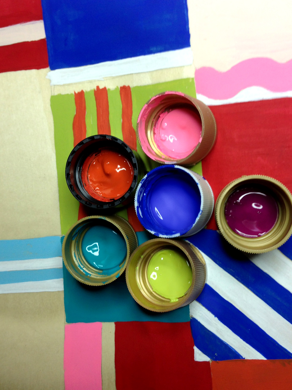
The challenge was deciding which colors to use when I painted this plate. Sure, I wanted red and blue and white. But then, what next? I opened bottles of paint and literally laid the tops on the piece just to see what would work. No, I didn't just pick anything but those that offered interesting, colorful contrasts.
When I worked for a patio furniture company, we paid close attention to color. Each season the Pantone color council made a prediction of the next years colors. Where they got that information always remained a mystery to me. However, we did play very close attention to the colors the manufacturers of outdoor fabrics offered (who apparently did pay attention to Pantone) because the painted frames we offered had to match or compliment those cushions and slings in some way. It was easy when white frames ruled the field for years, one of the longest runs ever. The oranges, avocados, and egg yolk yellows were a thing of the past. To repair one was literally a blast to the past! They made things that color we would ask? And people, well, bought them? They were replaced by sedate tan and chocolate, then white. Oh sure, there were sea foams, pale blues, pinks and even black. They never dominated the market. It appears casual people play it safe too.
When the acrylic fabrics really took off, so did the use of color. Chartruese, melons, bright blues became popular but were always offered against quiet white, tans, metallic coppers, browns and muted beige frames with these same colors woven through the fabrics with browns and blacks maybe even a splash of gold and red. It was fascinating. You'd go into a store that was bright and white and turn 180º to see dark and sedate.
Color is important in our lives. It can make us feel good and alive, or it can make us calm or even bored. Who has ever sat in some bland government office where the bilious green walls seemed to stretch forever? You have to wonder, how can these people come here to work? No wonder they are so grumpy. I'd be grumpy too. Seriously, consider the colors around you. Do some make you feel peppy? Do others bring you down?
Find what your color is. Play it safe but then don't be afraid to add a splash of color in your home, on your person. In every room, on every outfit. Its the contrasts in life that make it all the more interesting.
Check out my store, krugsstudio.etsy.com. There are plenty of colorful objects there!
Alan
No comments:
Post a Comment